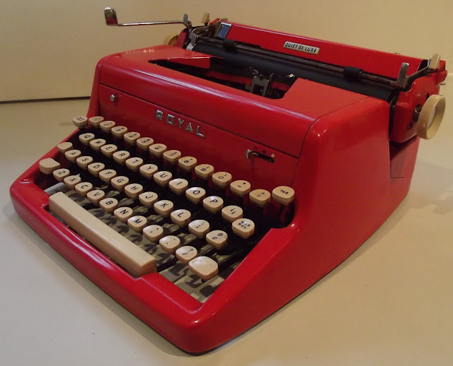
Well, despite all the best wishes from readers of my highly excited "Robert's Day" post (thanks for the thought, Rob Bowker), I didn't win the $100 million Lotto. I invested $14.50 and won $13.50, but I guess I was still way, way in front on the day - and not just the $300 winnings on the Melbourne Cup. So, still feeling very much in the pink from the exhilarating day before (and not being in the red), I got out a pink and a red Royal Quite De Luxe portable typewriter and gave them a whirl to celebrate the occasion:


3 comments:
The Royal deluxe certainly looks striking in red and pink! In most other things I have always preferred blues and greens over pinks and reds. Yet I find myself wanting a pink typer too (a desire I shall attempt to keep in check!). The deep salmon pink of the lettera 22 and the Olympias are more pleasing to my eyes, though. The colour seems to lend a certain light-heartedness and fun to these solid and often serious looking machines. It might be a sacrilegious thought but no harm done just imagining pink on one of the early behemoths, say the Scholes and Glidden; that would cast quite a different light on them!!! :)
Ha ha ha ha.... I will concede - I'm in love with the colour and that style of that red machine. I have always found the red QDL to be the most alluring. I think I even said that in person when I saw that machine in the metal.
One day.... One day....
Oh those white keys and that wonderful red. Next time I swing by I might have to bring a pantone book and see if I can identify exactly that colour, and re create it.
aaaaaaaaaaaaaaaahhhhhhhhhhhhhhhhhhhh (drifts into dreams about writing on a red QDL).
Great looking typewriters, and I see they both have that excellent Royal typeface.
Post a Comment